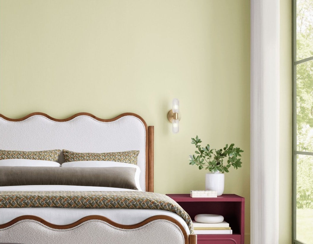
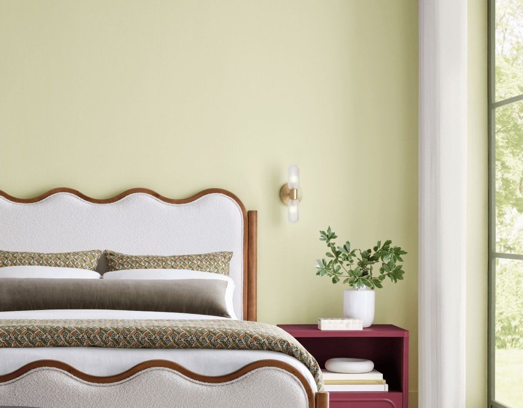
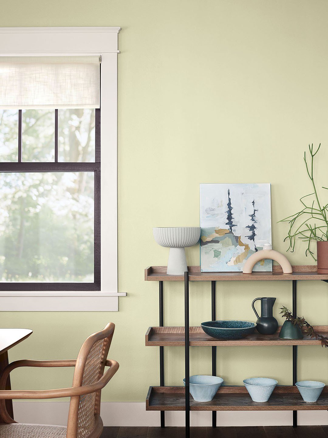
Every fall we check in on Sherwin-Williams's Color of the Year, and every year the pick says something about where people want their homes to go next. Last October it was Universal Khaki SW 6150, a warm midtone neutral with a slight yellow undertone. This year the company stayed on the warm side of the wheel and stepped into color: on September 15, Sherwin-Williams and HGTV Home by Sherwin-Williams jointly named Celery SW 6421 their 2027 Color of the Year.
Sherwin-Williams calls it "a soft, muted green with subtle yellow undertones." Domino, which covered the launch the same day, put it more playfully, telling sage green it had a good run. If you've been watching sage take over kitchens and bedrooms for a few years, Celery reads like the next step: brighter, a little sunnier, and a lot less gray.
What Sherwin-Williams says it's about
Celery came out of the company's 2027 Colormix Trend Forecast, which it titled Rewild, and it was selected by Sherwin-Williams's Trendsight Team. The reasoning is all wellness and nature. Ashley Banbury, color marketing manager at Sherwin-Williams, said in the announcement that the color "reflects today's priorities: wellness, balance and connection," and pointed to a growing interest in eco-inspired design and in bringing elements of the natural world indoors through color.
The official description leans into that. Sherwin-Williams compares stepping into a Celery room to stepping into a sunlit clearing, and says the shade balances "energizing and soothing." On its own Color of the Year page, the company describes it as sitting somewhere between an airy pastel and a grounded, herbal hue.
The numbers, for anyone holding a fan deck
Here's what Sherwin-Williams itself publishes for the color, so you can take it to the store or hand it to a painter:
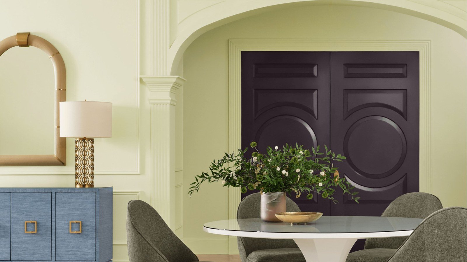
Celery SW 6421. Hex #E0DDBD (RGB 224, 221, 189). Light reflectance value (LRV) 71. Sold as Celery HGSW6421 in the HGTV Home by Sherwin-Williams line at Lowe's. Sherwin-Williams offers free color chips, plus peel-and-stick and paint samples.
That LRV matters more than the name. At 71, Celery bounces back most of the light that hits it, so it behaves like a light color on the wall, closer to an off-white with a green cast than to a true green. Keep that in mind for what comes next.
The palette it came with
Sherwin-Williams didn't release Celery alone. It paired it with a curated group of supporting colors from the Rewild forecast: White Flour SW 7102 and Woven Wicker SW 9104 as the light neutrals; Georgian Bay SW 6509, Artichoke SW 6179 and Cocoon SW 6173 as the deeper anchors; Kirsch Red SW 6313 and Plum Brown SW 6272 for warmth; and Potentially Purple SW 6821 and Cosmos SW 6528 as softer accents. There's even a matching wood stain, Minwax Pickled Oak MW 260.
If you want a single place to start, Banbury has been clear about it. "Woven Wicker is a beautiful paint pairing," she told Domino, and she steers people toward warm materials in general: light and medium woods like oak, aged brass and bronze to bring out the yellow undertone, plus linen, woven materials, natural stone and handmade tile.
Where the designers are already using it
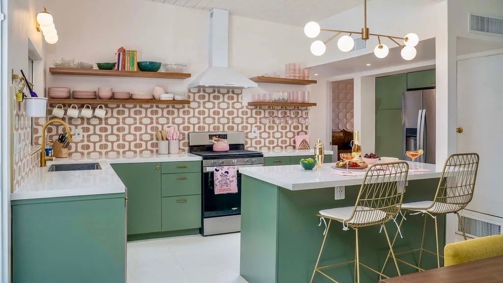
Domino rounded up a couple of real homes that got there early. Pro skateboarder and Olympian Lizzie Armanto and her design firm, Studio Hanego, used Celery as one of several punchy shades in a color-blocked set of kitchen cabinets in her Los Angeles home. In a Laurel Canyon bungalow designed by Gianpiero Gaglione, it went onto traditional bathroom wainscoting, where it reads fresh without taking over.
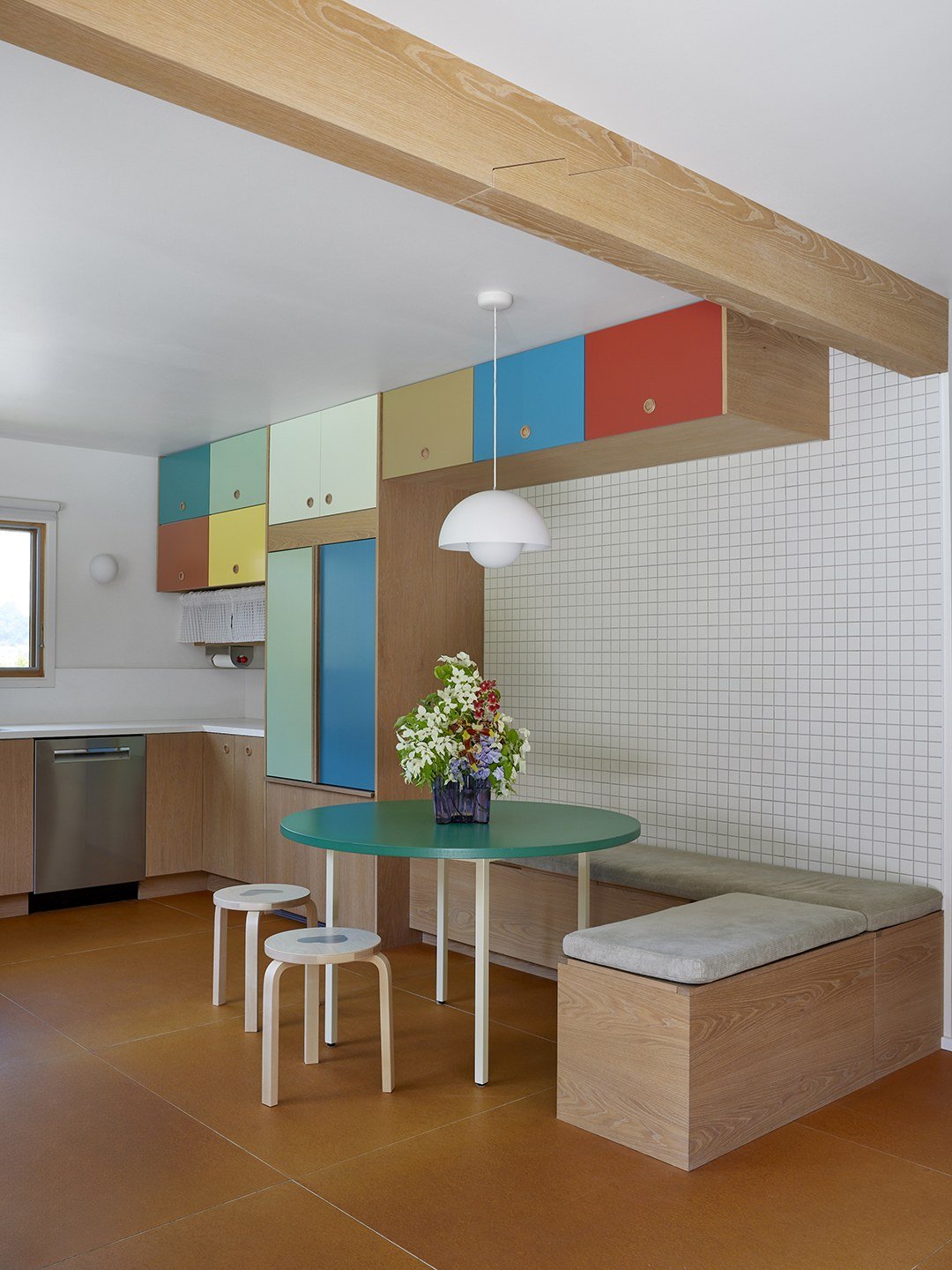
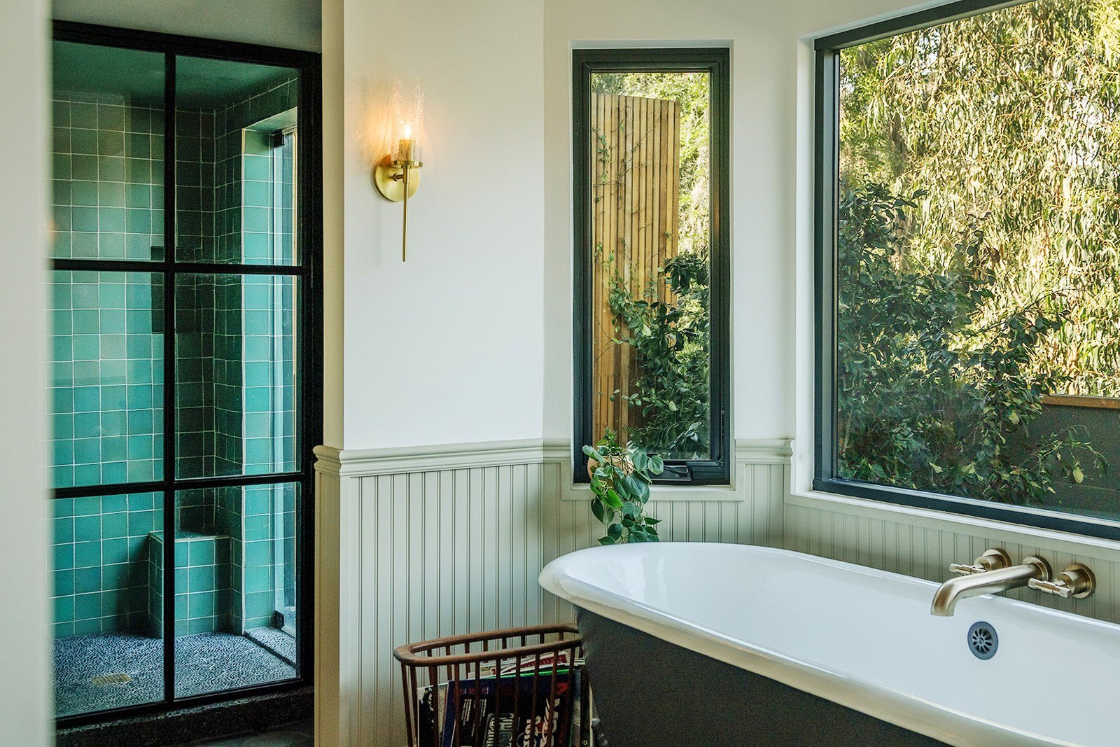
Banbury's own short list of rooms: kitchens, breakfast nooks, sunrooms and bedrooms. For something less expected, she likes an entryway, where the color gets "immediate impact in a relatively contained space," or a painted ceiling. She also suggests smaller doses: a bathroom vanity, a door, the back of built-in shelving, the inside of a pantry or closet, or a vintage piece that needs new life.
How it works in a post-and-beam house
Here's where our part of the coast comes in. A classic Orange County midcentury, the kind you find in Mesa Verde, Cliff Haven or up the Laguna canyons, doesn't give paint much to work with. Walls of glass take up whole elevations. The ceilings are exposed wood, the beams run straight out past the glass, and the light coming in is strong for most of the year. The paint lives on whatever solid wall is left.
That actually suits Celery. Sherwin-Williams built the whole Rewild story around bringing the natural world inside, and a post-and-beam house does that on day one: you're already looking at the garden, the canyon or the eucalyptus through the glass. A soft green on the few solid walls picks up what's outside instead of competing with it.
A few things we'd keep in mind:
Leave the wood ceiling alone. Banbury likes Celery overhead, and in a drywall ceiling that's a great idea. Over tongue-and-groove and exposed beams, the wood is the point. Put Celery below it and let the two talk. Her note that light and medium woods reinforce the color's organic side, while deeper woods make it feel more sophisticated, is a handy guide to what your ceiling will do to it.
Sample it in your actual light. With an LRV of 71, Celery reflects a lot, and coastal sun is bright. On a wall that takes afternoon sun through a big pane of glass, expect it to read paler and warmer than the chip. On a shaded wall it'll hold more of its green. Sherwin-Williams offers free color chips and peel-and-stick samples you can order, so put one up on each wall you're considering and check it morning and late afternoon before anyone opens a gallon.
Think small and intentional. The spots Banbury suggests line up well with midcentury houses: a built-in bookcase back, the inside of a wall of cabinets, a front entry, a powder room. They're contained, they're easy to change, and they give you a hit of color without fighting the glass.
Pick the hardware on purpose. Aged brass and bronze are Sherwin-Williams's own suggestion for bringing out the yellow undertone, and warm metals are already at home in a lot of midcentury kitchens and baths.
Celery is a soft, fresh yellow green with subtle warmth that brings a calming yet uplifting presence to any space.
Ashley Banbury, Sherwin-Williams
If you're getting a house ready to sell
A Color of the Year is a fun read on where taste is going, and it's a smart place to borrow an idea from. For a home you're about to list, we'd use Celery the way Banbury suggests using it in a small room: in one or two considered places, where it adds character without asking every buyer to love it. For a home you're keeping, go ahead and give it a whole wall. It'll probably look great against the wood.
Sources and credits
Original story: "Sherwin-Williams's 2027 Color of the Year Is Deeply Refreshing," Domino, September 15, 2026. Designer quotes from Ashley Banbury as published by Domino.
Color name, number, palette, reasoning and announcement quotes: Sherwin-Williams and HGTV Home by Sherwin-Williams, press release via PR Newswire, September 15, 2026, and the Sherwin-Williams 2027 Color of the Year page. Hex, RGB and LRV from Sherwin-Williams's published color data for Celery SW 6421. Last year's pick: Universal Khaki SW 6150.
Photography: bedroom, dining room and shelving images courtesy of Sherwin-Williams (the shelving image as published by Domino). Lizzie Armanto kitchen: photography by Jessica Alexander, styling by Studio Hanego, courtesy of Domino. Laurel Canyon bathroom: photography by Pablo Enriquez, design by Gianpiero Gaglione, courtesy of Domino.