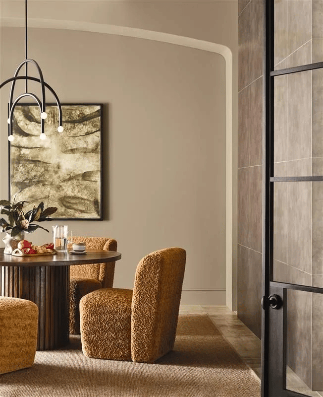
Non-boring beige is officially back. Meet Universal Khaki, paint brand Sherwin-Williams’s official pick for Color of the Year 2026, which the brand’s trend forecasters decided on alongside HGTV Home by Sherwin-Williams. According the brands’ color experts, they looked to a classic, highly versatile hue—one that reflects a growing desire for “embracing the essentials and creating spaces that feel restorative, balanced, and real,” says Sue Wadden, director of color marketing at Sherwin-Williams. The warm, mid-tone tan brings to mind a fresh canvas or a timeless piece of workwear, while also feeling luxe—a tricky balance to strike just right.
“We’ve continued to see a steady shift away from cooler grays toward warmer, sanded neutrals that feel approachable, lived-in, and sophisticated,” says Ashley Banbury, color marketing manager at HGTV Home by Sherwin-Williams. “Universal Khaki feels especially right for 2026 because it reflects how people want to live today: clean, simple, and with intention. It’s a shade that delivers warmth and connection to nature, which is something homeowners are craving as they design spaces that feel restorative and welcoming.”
Universal Khaki is part of a larger palette for both brands. HGTV Home by Sherwin-Williams is announcing it along with a corresponding Color Collection of the Year called Honest Essentials; Sherwin-Williams listed the understated shade as part of its “Foundational Neutrals” palette in the brand’s Colormix Trend Forecast Anthology: Volume Two, which was announced in July.
When Volume One of the forecast was released for 2024, the paint brand strived to frame its collection as objectively as possible. How else can you explain such straightforward-named palettes like Blues and Greens and Reds and Purples? It may sound reductive in a vacuum, but at the time this pared-back approach to storytelling meshed perfectly with our post-(post-?)pandemic desire to use color as a vehicle for creativity and self-actualization.
After Sherwin-Williams’ Trendsight Team of forecasters had two years to see how those colors showed up in the real world, their 2026 Colormix Trend Forecast Anthology: Volume Two provided a “refined evolution” of Volume One’s open-ended celebration of color, organized into four expressive palettes that indicate both a softer gaze and a sharper focus. “It’s centered around the whole idea of constant evolution,” Sherwin-Williams color marketing manager Emily Kantz says when discussing the differences between Volume One and Volume Two. “Even minor nuances influence color in a big way.”
Below, we dive into Volume Two’s hues, and unpack how Universal Khaki fits in with them.
Frosted Tints
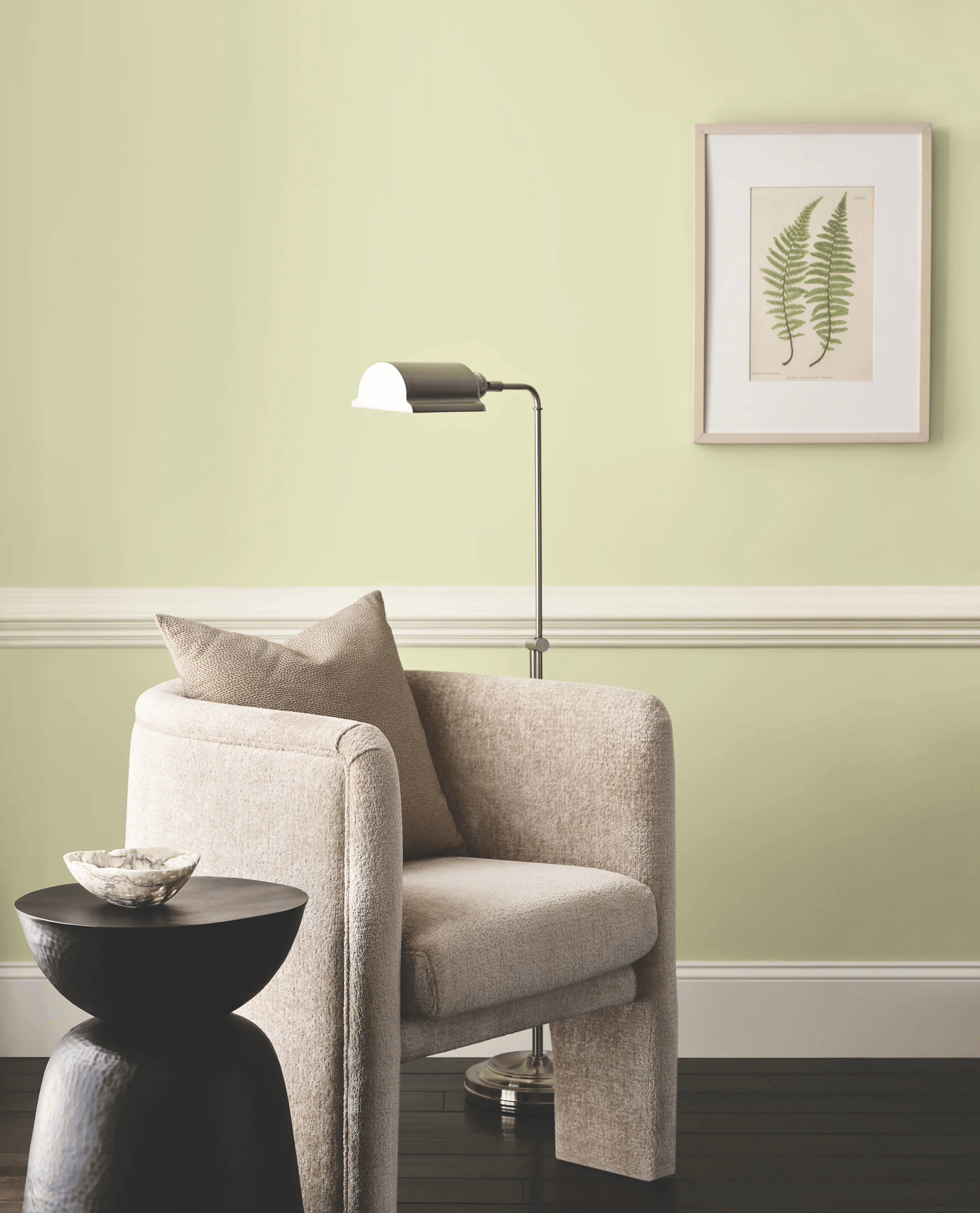
The 12 colors in the palette Frosted Tints articulate that notion clearly thanks to their playful separation of blues and greens from any biophilic context. Eschewing nature, these shades, which span from the near gray of Modern Lavender to the dusty green of Celery, feel sweeter and more pastel.
But when applied independently, and especially in minimalist contexts, Watery, Grape Mist, and Lite Lavender read less as Easter Sunday, and more as sophisticated elegance. To integrate these Frosted Tints into existing design trends, Kantz advises applications in the kitchen. There, a softly colorful cabinet can stand out from any cool, chromatic neutrals without raising the temperature.
“If you take a minimalistic, pared-back aesthetic and you inject one of these softer colors like Halcyon Green, it instantly elevates that space and brings a dose of life to it.”
Sunbaked Hues
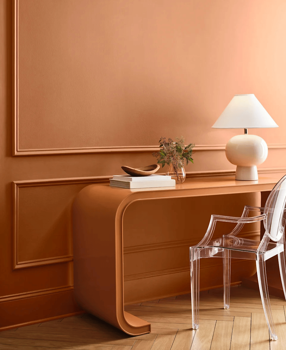
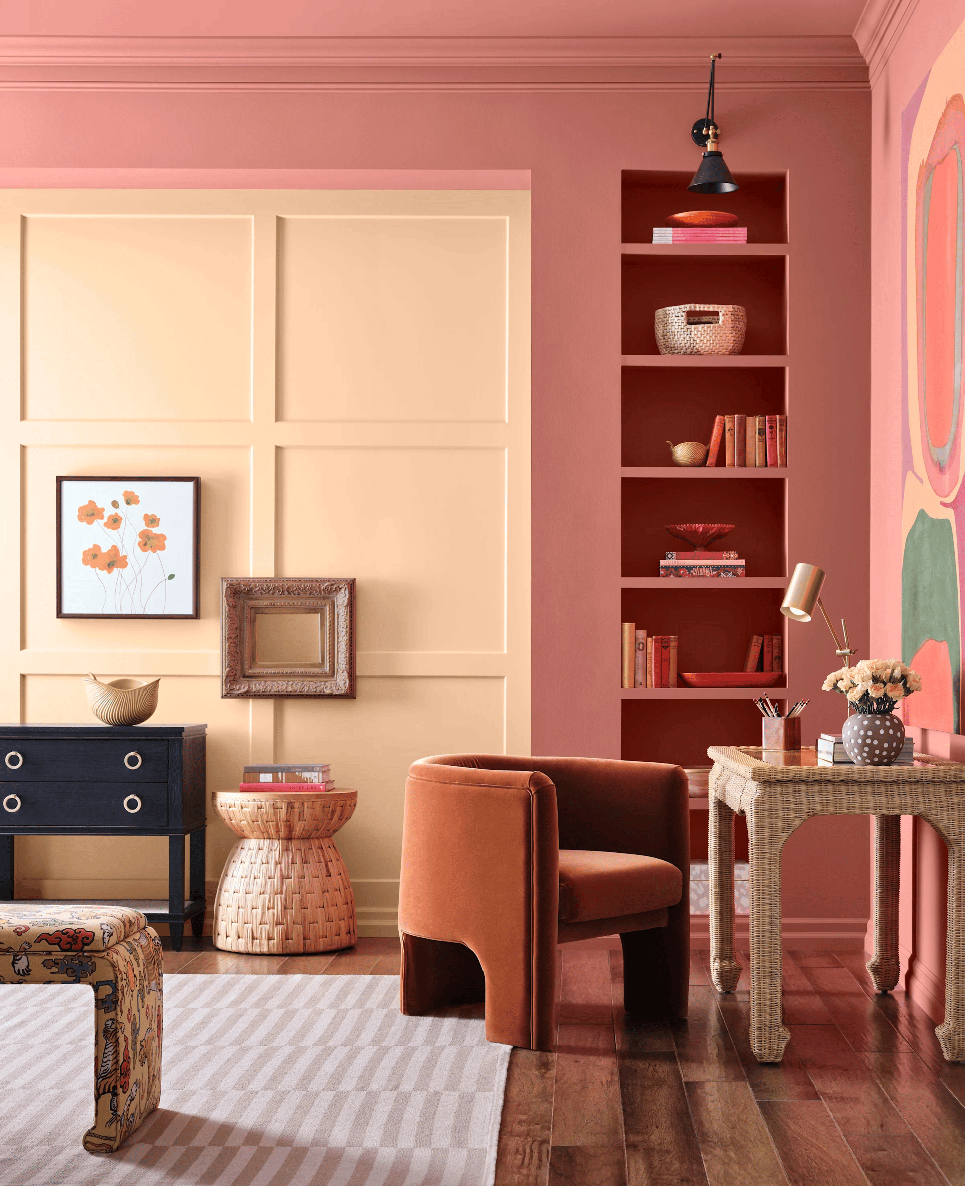
Despite its arid appearance, the Sunbaked Hues palette represents another sort of reaction to blues and greens—or at least their hegemonic rule over the boundaries of “biophilic” color aesthetics. Indicative of influences such as Georgia O’Keefe’s 1930s paintings and Frank Lloyd Wright’s Taliesen, Sunbaked Hues argues that sun, sand, and fire are just as worthy of a place in those design conversations alongside watery blues, floral greens, and grounding earth tones.
Indeed, within the palette itself, warm shades abound: from the terra-cotta of Coral Island to the full-bodied passion of Heartthrob. Lemon Chiffon and Sundew, Classic Yellow and Armagnac—all evoke dusty landscapes and hazy sunlight. Sunbaked Hues encourages us to find more nuance within sunlight throughout the day. That makes these colors a brighter alternative to Frosted Tints, capable of letting light into a cold space.
Restorative Darks
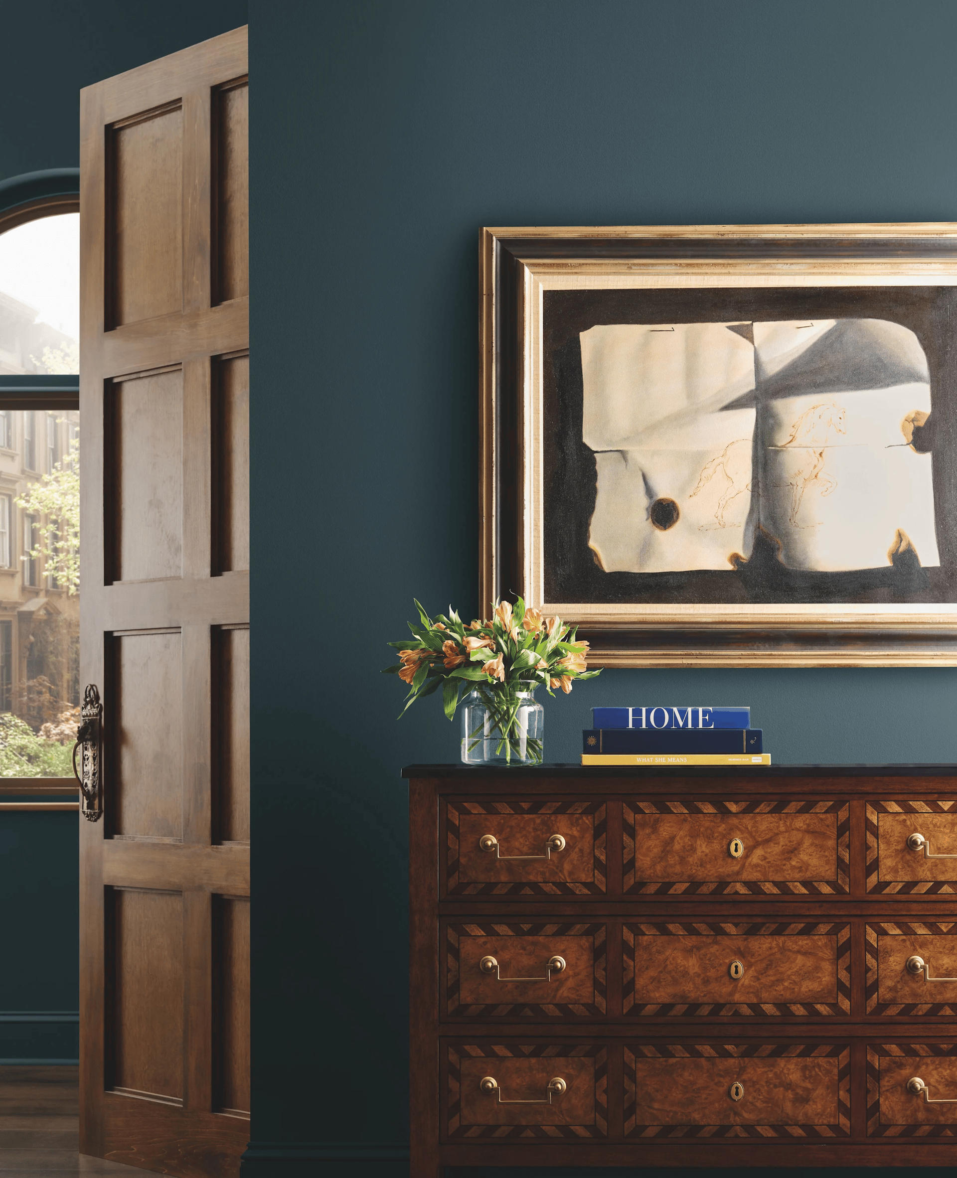
Much less of a radical reconception, Restorative Darks is, Kantz admits, the palette that most closely resembles its Volume One predecessor. But rather than just reaffirming a trend, Volume Two explores the deepest depths of our continued love affair with rich, robust colors.
To do that, Kantz and the Sherwin-Williams team decided to break down one of their most beloved colors, Carnelian, to explore new avenues.
“Carnelian has been in multiple forecasts in the past few years,” Kantz explains. “So we took it and pulled it apart. We made it a little bit more red for Dark Auburn, but then we also made it a little bit more purple in Plum Brown.”
That’s not to say red and purple are the only way to think about Restorative Darks. From the beaming rays of Relic Bronze to Tarragon’s smarter, more stylish take on teal, there’s a deep, time-tested color that can pair with any room’s particular material profile. For those interested in a more timeless (and cautious) way to approach color-drenching, Garden Gate, Limestone, and others can make for a strong but nonetheless welcoming statement.
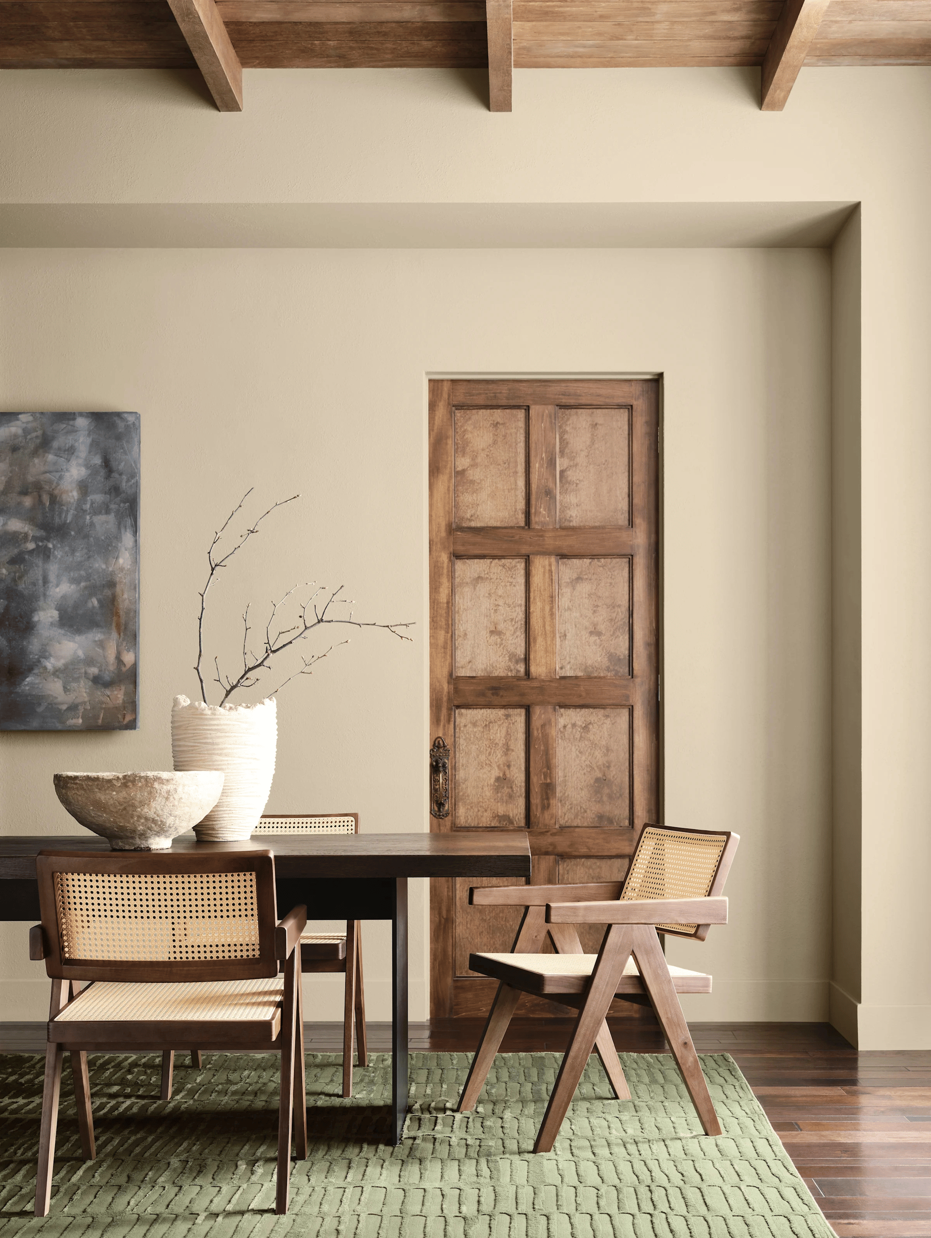
Foundational Neutrals
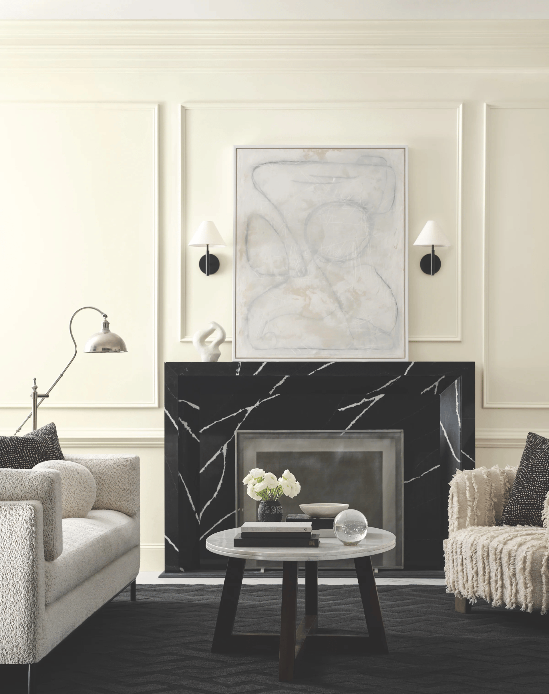
This is where Universal Khaki comes in. Since, as Kantz says, “grays are never going away,” the modern classics of Foundational Neutrals balance the need for something dependable with a desire for self-expression. Covering the spectrum from White Snow to the blue-black of Inkwell, these neutrals serve as a solid backdrop, though their subtle shifts in undertone invite closer inspection.
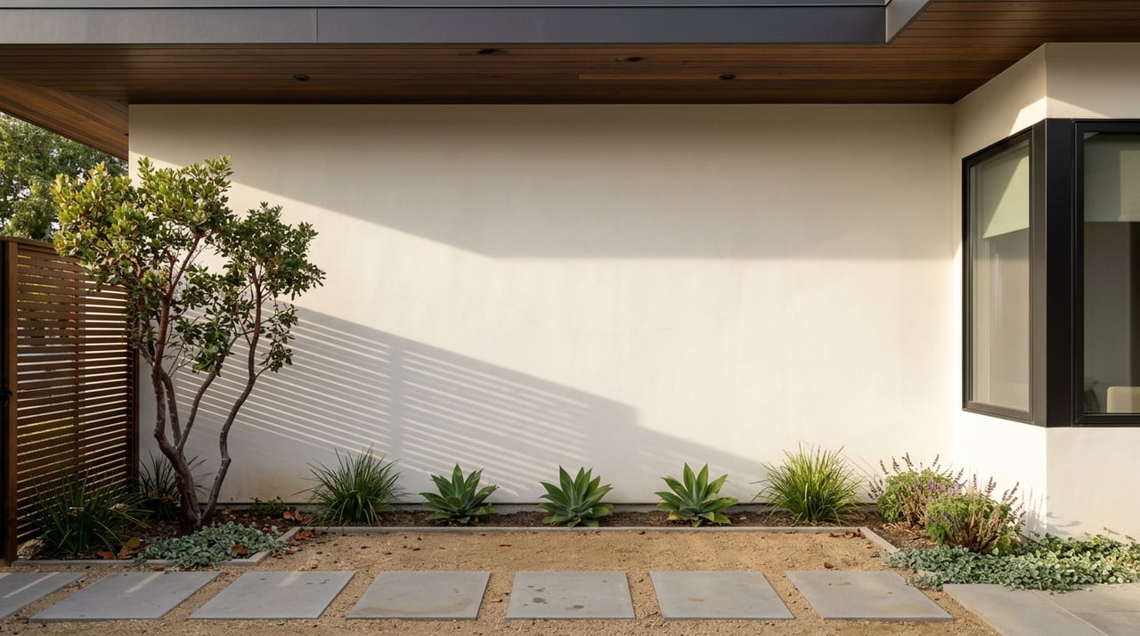
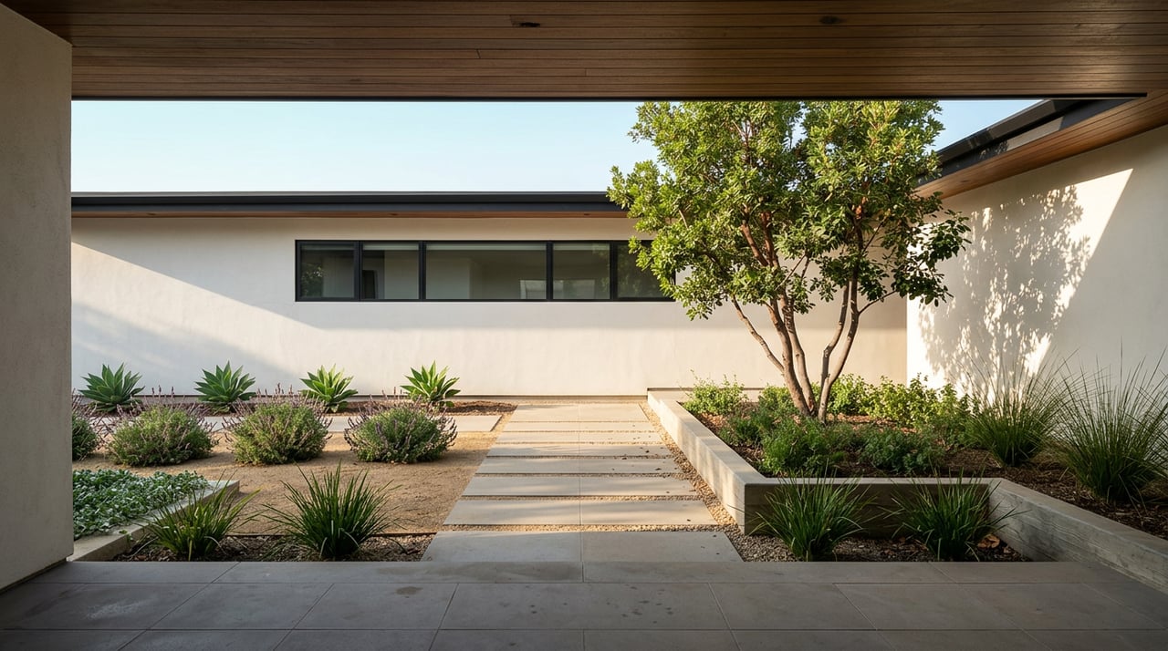
The end result is a set of contemporary colors that evoke a familiar warmth. Shades like Sanctuary and Armory suggest the possibility to create a sense of safety and comfort within our homes. Universal Khaki, the brand’s 2026 Color of the Year, embraces the return of that ubiquitous ’90s shade, offering a way to stand out while taking refuge in the past. Even Clove, with its bronze undertone, finds a way to make black shine a little bit brighter. In short, Foundational Neutrals can elevate your style and keep you on top of color trends without having to throw away all of your neutral-colored furniture. “We’ll [continue to] see more interiors built on versatile neutrals that provide a strong foundation for creativity, layered textures, and meaningful accents,” Wadden predicts. “This direction also reinforces the importance of adaptability, colors, and designs that can evolve as our lives do. I think we’re entering an era where design is less about following fleeting trends and more about cultivating lasting beauty, and Universal Khaki sets the tone for that shift.”
Originally published in Architectural Digest
Text by Tim Nelson and Katie Schultz