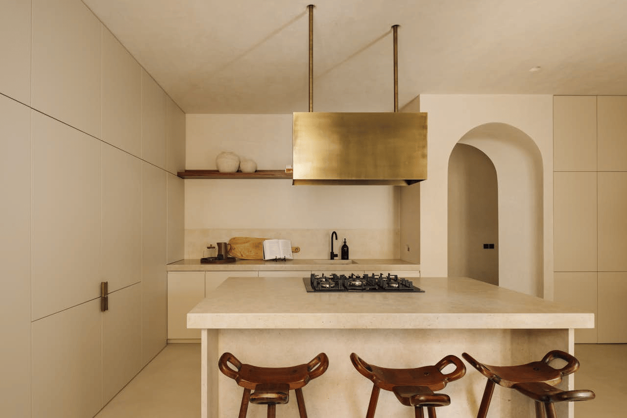
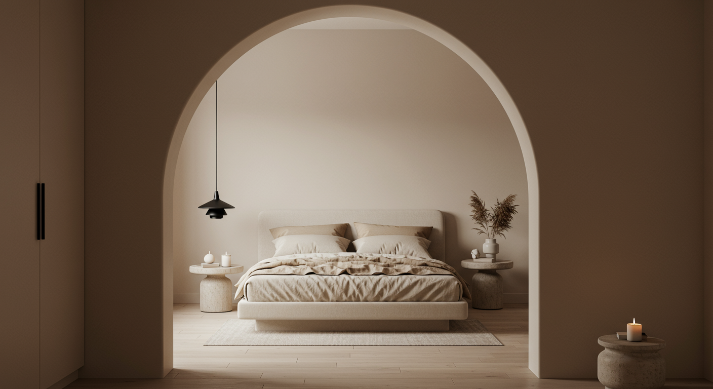
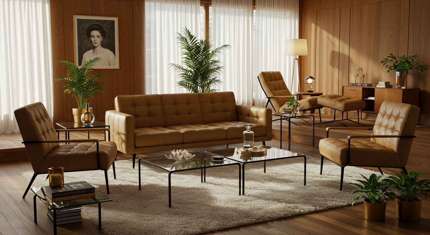
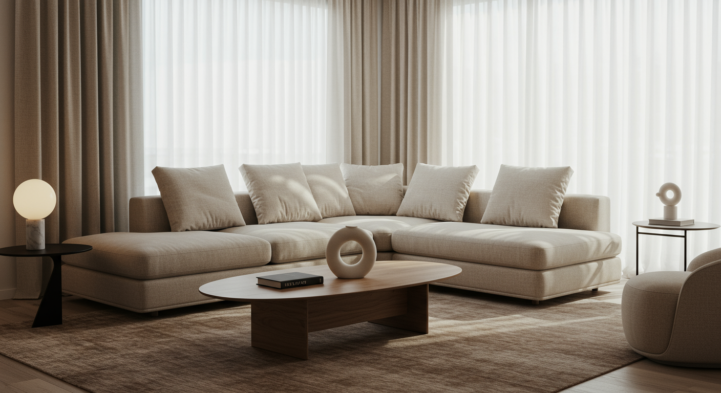
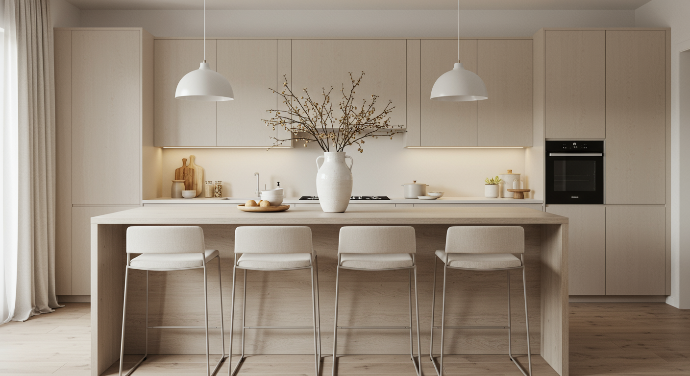
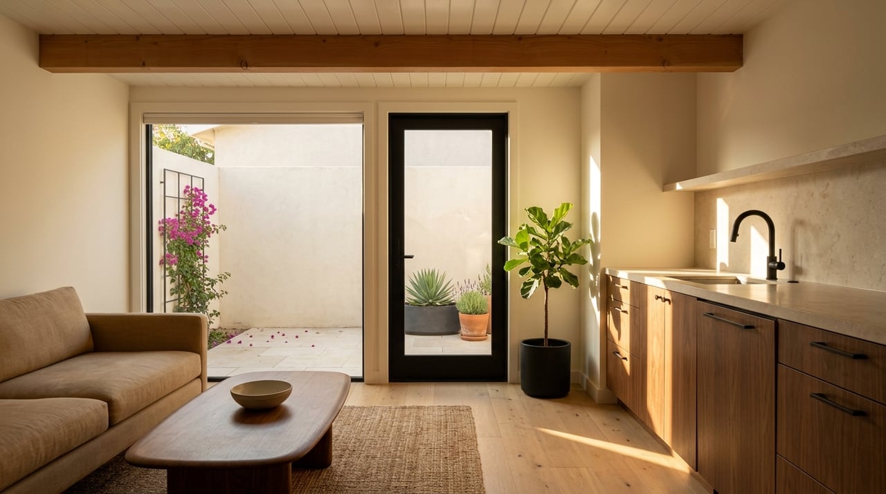
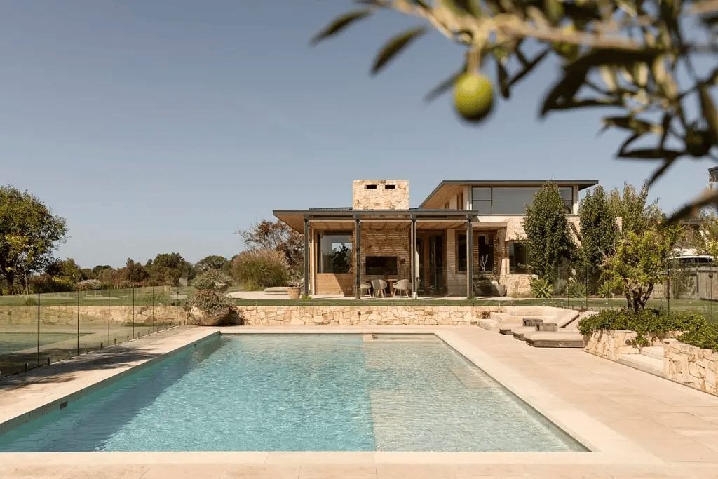
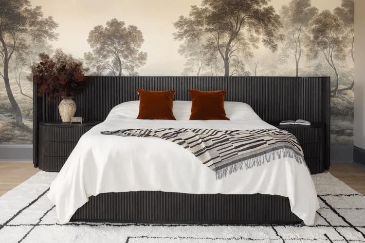
If you’ve noticed a recent resurgence of beige in interior design, you’re not alone. After blending into the background for most of the past decade, largely overshadowed by blushy pastel hues or frictionless gray tones, beige is enjoying a second wind as a go-to neutral color choice. The comeback of the creamy hue and its explosion across the spaces we inhabit has even earned its own catchy internet characterization: "beigification."
While the classic neutral never did a complete disappearing act, its cultural perception and embrace has shifted over the past few years. Once primarily synonymous with blandness and bore, "beige-ness" also signifies a particularly of-the-moment brand of status and luxury packaged as an aspirational aesthetic. But why is this specific neutral hue replacing its not-so-saturated counterparts and dominating our interior palettes? We reached out to Amanda Wyatt, founder of Design Insider, Gideon Mendelson, founder and creative director at Mendelson Group, and PJCArchitecture associate Juliana Sorzano to get to the bottom of beige’s big comeback.
According to Wyatt, the explanation is simple: people have grown weary of the stark whites and nondescript millennial grays that have inundated the interiors of basically any new or renovated apartment or home since the widespread influence of the bland HGTV home makeover that predated the rise of 2010s minimalism. In the place of those cool hues is a demand for neutral colors that add a subtle warmth and inviting vibe.
"With its soft, golden undertones, [beige] is the perfect way to achieve that," Wyatt says. "As a warmer neutral, it offers the same versatility as white or gray but adds a layer of warmth and depth that feels timeless and welcoming. Whether used on walls, furniture, or textiles, beige creates a cozy, sophisticated backdrop that brings a sense of comfort to any room." The current "beigification" offers a natural progression from prior interior design trends dominated by cooler tones. (Turns out "greige" was something of an unofficial stepping stone.)
Obviously, beige isn’t for everybody, and the current "cool kid" of neutral colors isn’t alone in its ability to offer a homey, refined feel to interiors. We’ve seen a range of shades from moody blacks to butter yellows impact a space in similar ways (look no further than the top colors of the year). One major appeal of beige, however, is that the earthy hue can suggest sophistication without feeling somber or soulless. "Beige has a more traditional feel, evoking a sense of classic elegance, but it can still look clean and simple without the sterility of cooler tones," says Wyatt. "Its golden hue allows it to balance richness and subtlety, making it a great choice for those who want an interior that feels both refined and approachable. It enhances the space with an understated luxury that’s increasingly being embraced in modern homes."
Wyatt also cites the influence of the quiet luxury trend specifically: "As more people lean toward high-quality, subtle design choices, beige is proving to be the perfect balance between chic and comfortable."
In addition to creating a cozy environment, Mendelson praises beige for its calming properties. "Beige spaces quiet things down in our hectic lives," he says. "They also allow other things to take center stage. When entertaining, fashion and food become the pops of color, art can do the same thing."
If you’re looking to welcome beige back into the fold or spruce up your current arrangement by toning things down, the sky’s the limit due to the color’s versatility. With paints specifically, Sorzano suggests keeping factors like room size, mood preferences, and lighting in mind when choosing the right tint. "Shades of beige, such as taupe, warm gray, cream and warm white work well as sophisticated backdrops and pair well with other colors and textures without overwhelming the space," she says.
Whether the goal is to use it as an anchor color, as a total beige-out concept like Kate Upton’s luxe living room, or to create contrast to dress up your space, Wyatt counts Farrow & Ball’s Drop Cloth and Shaded White, Sherwin-Williams Accessible Beige, Dunn Edwards Swiss Coffee and Beigeing by Clare among her favorite beige options.
"I love a good beige anywhere because it can provide such a warm neutral foundation for other design elements," says Wyatt. "My clients who ask for color in their kitchen cabinetry typically still want a beige backdrop on the walls and trim. I also think beige can be a great pairing as the other half of a wall treatment. Perhaps you install a darker wall wainscoting on the bottom half of your wall and then paint with beige above the chair rail. Or you select a beautiful wallpaper but then put beige on the trim and ceiling."
Originally published in dwell
Text by Kenya Foy
