When I was a kid, September always began by heading to the garage to retrieve a box labeled “fall decor” from the towering stack of plastic Uline bins that lined the walls of my mother’s house. Opening that box felt like stepping into a magical world—out came the ghosts and ghouls of Halloween, faux carved pumpkins, fall-foliage-embroidered tablecloths, and cornucopia hand towels. Each season had its own corresponding box (winter, spring, summer, and fall) all packed to the brim with decorations that would transform our home with the change in weather.
There’s something to be said for updating your home to reflect the season, though perhaps not as extravagantly as my mother did. Yet, it’s charming nonetheless. We spoke with four designers to get their pro decorating tips for curating your own fall fantasy that doesn’t look like the aisle of a home decor store.
Contrast, Contrast, Contrast
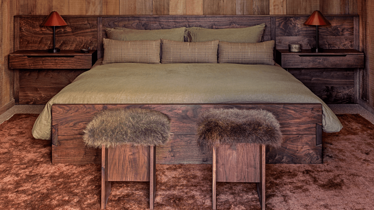
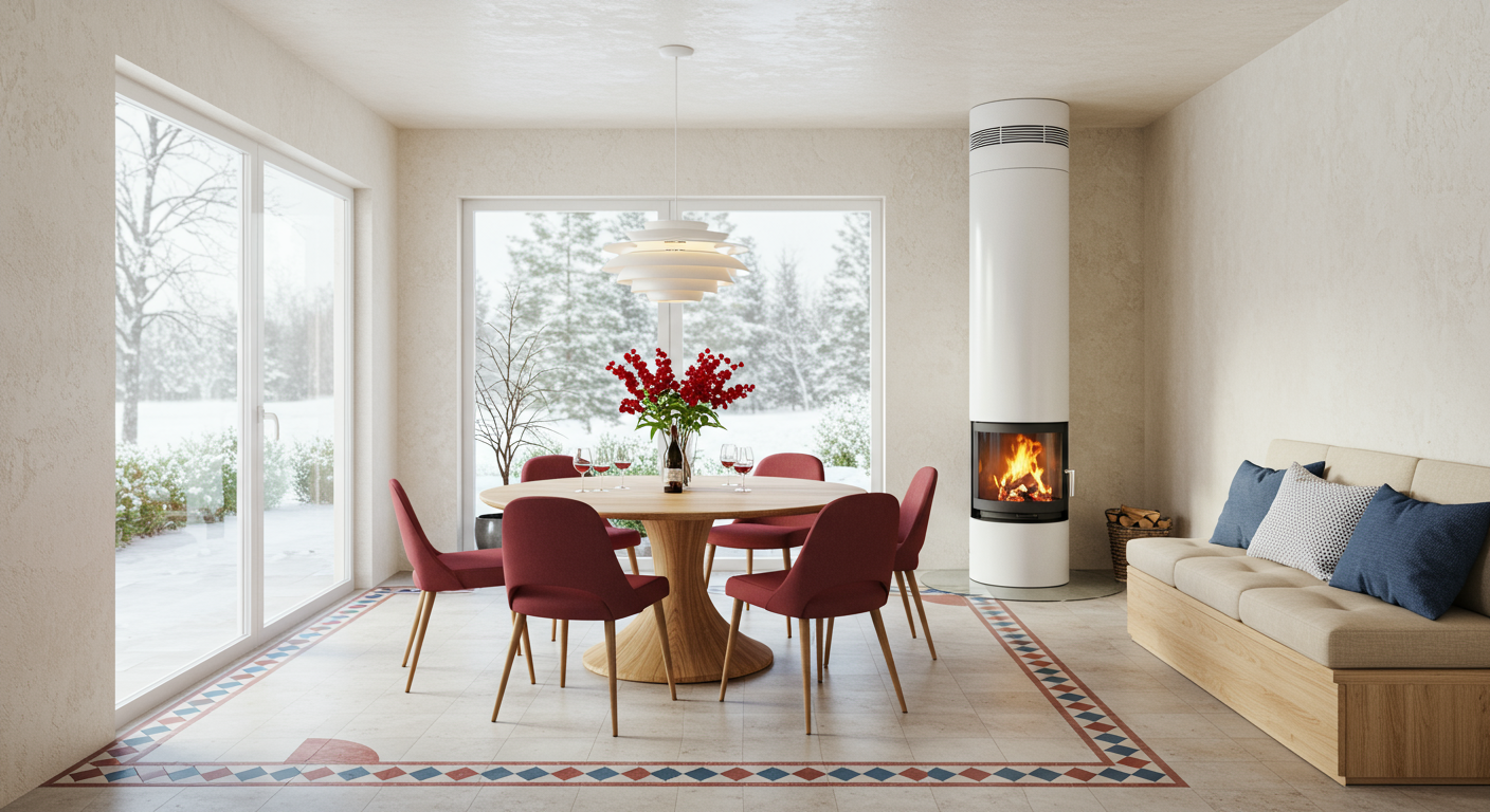
This fall, designers are reimagining the classic autumn color palette with fresh, bold hues like eggplant, deep blues, and marigolds. These vibrant shades combine to create a cornucopia of exciting colorways. Surrounded by Color founder Robin Heller and partner Jen Levyare are loving ochre, deep aubergine, and dark blue-green colors. “We’re not huge believers that colors go out of style—especially if they make you feel something special,” they share. The design duo is also passionate about purples and deep reds, adding that “browns are pretty transformative when paired with the brighter colors we use year-round.”
Anne McDonald, founder and principal designer of Anne McDonald Design, emphasizes how bold colors and deep contrast can make transitioning your space from summer to fall more seamless. “One of my perennial favorites is oxblood,” she says. “In the fall, we’re always eager to dive into deeper colors—it just feels so right. But it’s especially striking when paired with a lighter hue,” Anne explains. “For example, if you’re transitioning from a summer palette—maybe you’ve got some light blues, blush pinks, or even buttery yellows—those shades pair beautifully with oxblood. It really grounds the colors.”
The AD PRO Directory designer adds that “you can have this rich autumnal moment, but keep brighter colors alongside it, and they’ll still coexist beautifully.” The key to a cohesive fall transformation, it seems, is embracing contrast while letting those bold, warm tones take center stage. “I don’t think fall has to be tartan and those sort of classic fall colors,” she notes.
Bring the Outside In
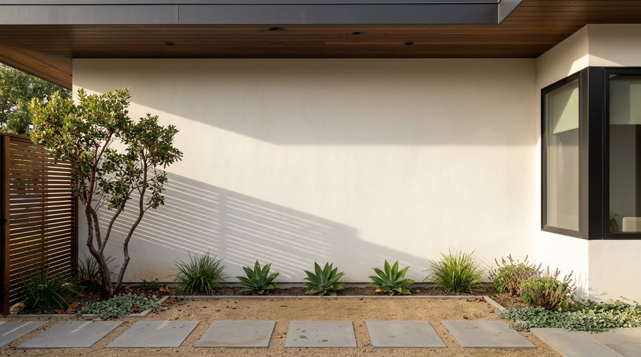
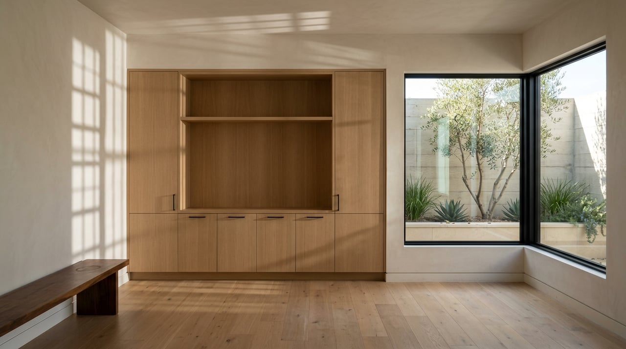
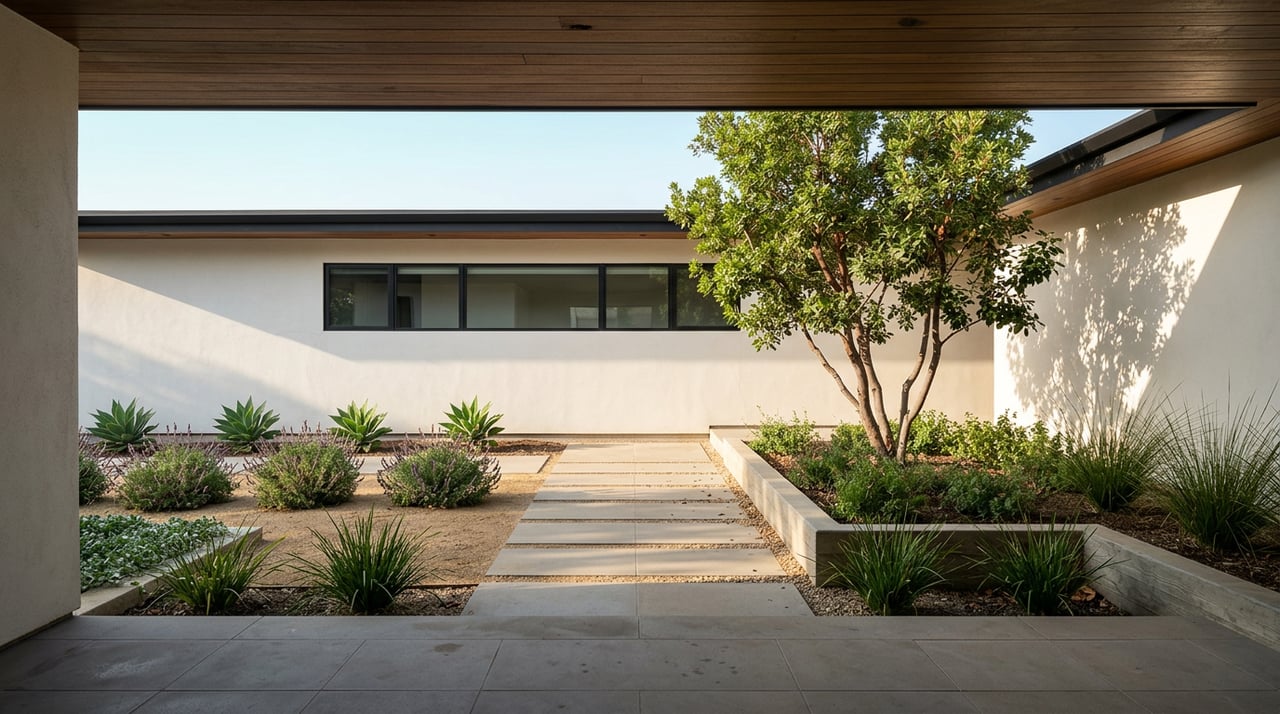
The beauty of fall lies in the simple pleasures of immersing yourself in the great outdoors: feeling the crisp air, crunching leaves beneath your feet, and watching the trees shift from shades of green to vibrant oranges and reds. Growing up in suburban Los Angeles, my mother’s enthusiasm for overt fall decor may have stemmed from the fact that we couldn’t fully experience these seasonal thrills firsthand. But there are subtler ways to bring nature indoors, no matter where you live—even if you don’t have the luxury of changing seasons.
During a recent project in Minnesota, McDonald worked with clients who wanted to reflect the beauty of the Midwest’s distinct seasons, especially fall. “I pulled inspiration from the autumn landscape,” she shares. “If you imagine leaves falling, turning brown, and decomposing into the earth, or think of prairie grasses swaying in the breeze—that’s what we aimed to recreate. Those beautiful hay-colored drapes, for example, feel like autumn prairie grass.” The result was a subtle earth-toned palette that evoked the natural midwestern surroundings. Anne also commissioned a local artist to create a custom piece using sediment from nearby rivers, adding dye to craft “an ethereal painting that captures the essence of the region’s natural beauty.”
For AD PRO Directory designer Ashley Lavonne, fall is all about getting grounded. “Fall gives me a sense of rootedness—maybe it’s the idea of the ‘harvest’ that resonates,” she explains. “I think the traditional colors of fall produce, like deep oranges, greens, and burgundy, provide the perfect foundation for building an autumnal color story.” Lavonne’s memories of the Midwest also inspire her fall decor. “Back-to-school fashion, especially plaids and dark wools, along with the changing leaves of massive oaks and maples—those amber and rust tones—immediately come to mind,” she adds.
Of course, fall’s natural color palette is an endless source of inspiration for many designers. “Living and working mostly on the East Coast, we get to see the leaves turn into these incredible rich earth tones,” Levy and Heller explain in an email. “We love bringing those hues indoors and orienting spaces around gorgeous fireplaces, which instantly makes a room feel warm and inviting.”
Tap into the Essence of Fall Feels
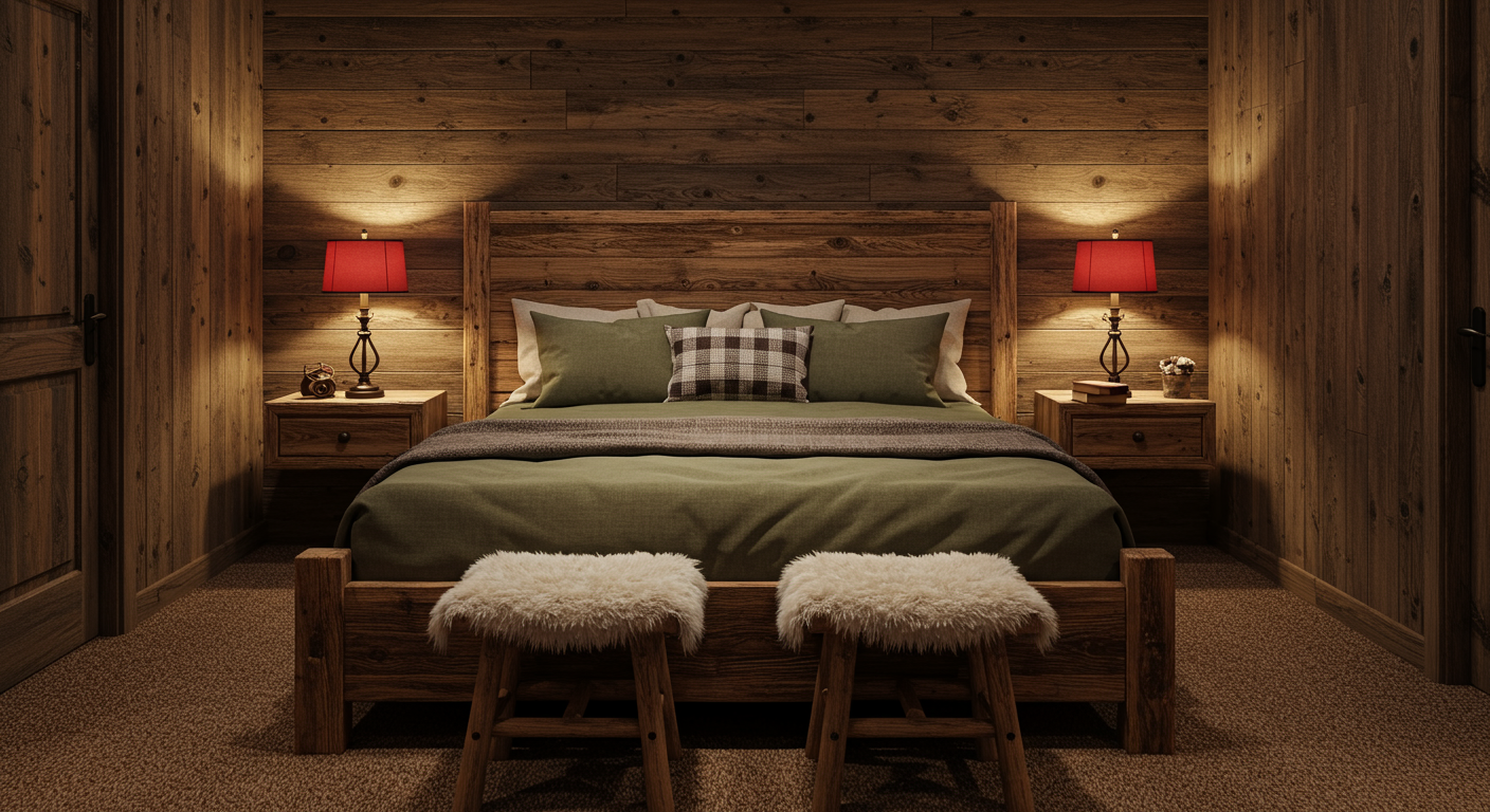
When translating the warmth of the fall ambience into a room’s color palette, it’s all about embracing rich hues and opulent textures that capture the essence of the season. “As the days get shorter and you spend more time indoors, your space should feel cozy—more comfortable,” explains Lavonne. “You’re likely entertaining more, so textures should be both sumptuous, like cotton or mohair velvet, and slightly formal, with a tighter weave for a polished look.”
To achieve those cozy fall feelings, Levy and Heller suggest layering neutral tones with pops of richer, darker colors. “You can incorporate these pops through rugs, window treatments, or pillows—all the coziest elements in the room,” they explain. “Big floor pillows and inviting patterns help draw people toward the windows or fireplace, making the space feel warm and welcoming.”
Texture also plays a major role in evoking comfort and warmth. “In a recent sunroom den design, we used custom sofa fabric with lots of texture, paired with plenty of pillows. It harmonizes beautifully with the natural scenery outside,” Levy and Heller explain. “Swapping in blankets and accessories as the seasons change can enhance that seasonal warmth—especially with a fireplace nearby.”
McDonald also encourages textures in unexpected places, like wallpaper. “Nickey Kehoe has a beautiful wallpaper with a vertical stripe and floral scroll motif. The colorways nail an alternative autumn palette,” she says. “What I love about it is that it’s made of grass cloth, which gives it a three-dimensional quality that’s perfect for fall. It blends a spring-like floral with the texture of grasscloth, creating a cozy, layered effect.”
McDonald adds, “The muted yet colorful palette feels emblematic of fall. It’s not just about going bold—it’s about creating depth and warmth through color and texture.”
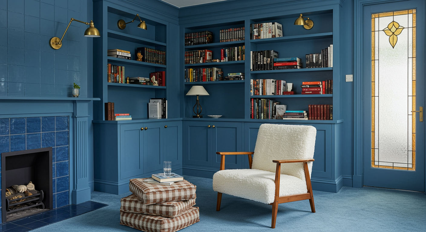
Heat Up With Warm-Toned Metals as the Temperature Cools Down
As fall approaches, a perfect way to add warmth and a touch of edge to your space is by incorporating rich, warm-toned metals like gold, brass, and copper. Once the darlings of ’70s and ’80s design, metals like brass and bronze ruled architectural projects before the 2000s ushered in the reign of stainless steel and chrome. Now, after years of gleaming cool-toned kitchens and appliances, the warmth of copper is staging a comeback. Copper, already making a statement in commercial spaces, is poised to take its place in our homes. Fall’s inherent coziness makes this the ideal time to embrace warm metals—and with fall’s cozy vibe, what better season to welcome their rich, burnished glow.
McDonald recently sourced a stunning copper lighting fixture from 1stDibs, inspiring countless ways to incorporate texture and metal into fall decor. One standout piece she found is an early 20th-century German copper fixture with a hint of midcentury-modern style. “I think copper is perfect for fall because it can still have a modern shape, like mid-century modern, without feeling too farmhouse-y,” she says. “It doesn’t have to be associated with copper pans and rustic kitchens. Copper can maintain a sleek, modern look while anchoring itself in that rich, vibrant, very fall color.” McDonald notes that copper complements green and blue tones particularly well, making it an ideal fall accent. “Copper’s orangey hue is the complementary color to green, so it feels organic and authentic when paired together. It also helps tone down the space, bringing a sense of warmth and balance,” she adds.
However, McDonald cautions against going overboard with copper accents (though I already have 100 copper objects now on my 1stDibs wishlist). “Copper makes such a statement that you don’t need a ton of it to have an impact,” she advises. If you’re thinking about introducing copper into your fall decor, she has some bonus tips: “Because copper has a warm undertone, it pairs beautifully with brass or aged iron. You can mix it with other metal finishes, and it holds its own really well.”
Another reason to love copper? It ages beautifully. “Copper can develop a patina over time, but it doesn’t have to. Some pieces, like this light fixture, will keep their copper tone forever,” she notes. For clients looking to incorporate copper, she recommends smaller accents like vintage copper dishes for a coffee table, sconces over artwork, or even a copper vessel for flowers. “It doesn’t have to be a big piece,” McDonald says. “A small, character-filled vintage copper item can add just the right amount of charm and warmth to your space without overwhelming it.”
To create depth and interest, consider mixing textures—pairing brushed metal with perforated surfaces or polished finishes with hammered details. And remember, with strategic placement, a little goes a long way.
Originally published in Architectural Digest
Text by Mya Gelber